Redesigning the homepage
 Individual contributorDesign sprintA/B testing
Challenge
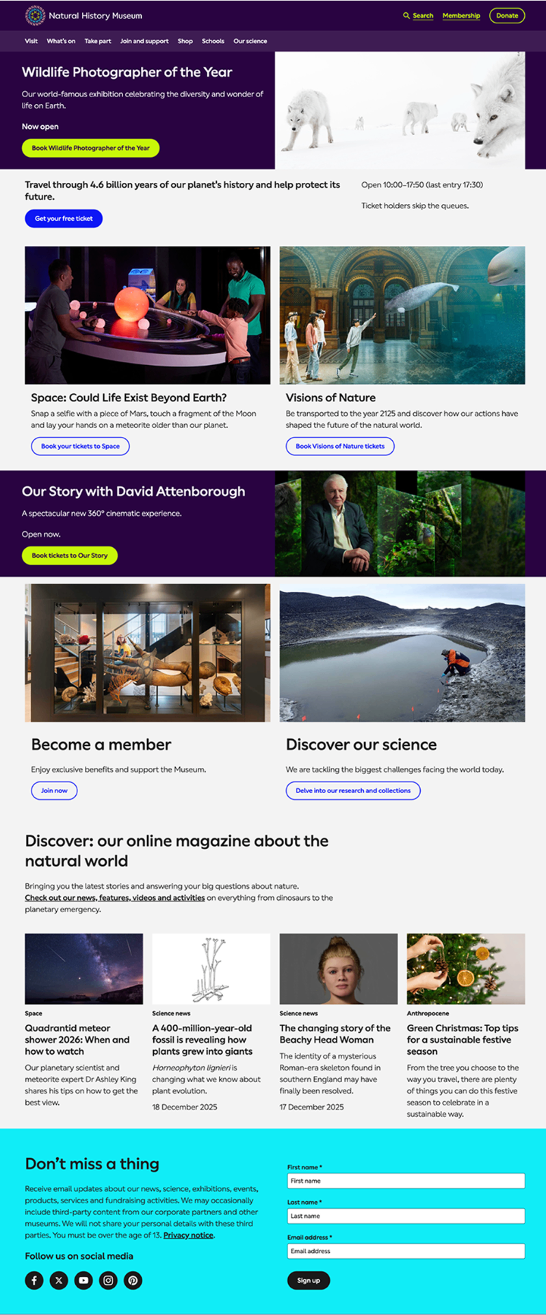
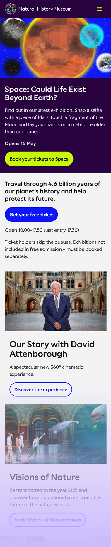
- The homepage was an overwhelming and cluttered mess, lacking clear and meaningful signposting for museum visitors.
- It prioritised what many different voices at the museum wanted to tell, not a unified voice giving users what they wanted to know and lacked a clear link to key user jobs-to-be-done.
- Used a misleading design pattern to unsustainably drive revenue.
- Did not align with the museum's strategic commitment to be welcoming for all.
Constraints
- Limited developer capacity so needed to be strategic, using existing components wherever possible and only requesting new or changes to components when the impact/feasibility deemed necessary to scale to enough other use cases.
- Senior leaders were understandably very sensitive to potential drops in conversion from this page, so we had to tread very carefully with each design decision, justifying and measuring each one precisely.
My role
Design sprint
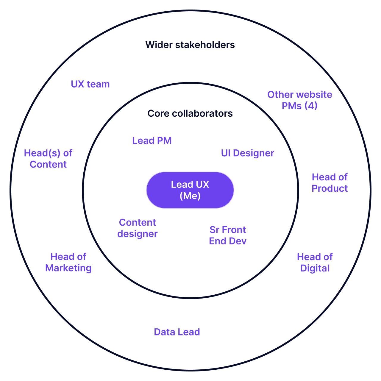
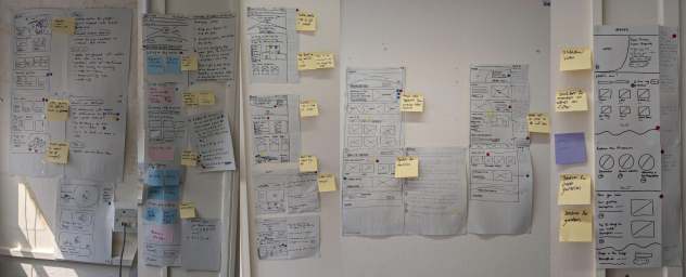
I planned and facilitated a 5-day in-person sprint with a cross disciplinary team of UX/UI designers, content designers, data analysts, product managers, marketing, contact centre and front-of-house team members.
- Map
- Sketch
- Decide
- Prototype
- User testing
Iterations, A/B testing & more iterations!
- We then got out of Figma and built a coded MVP with developers, ready for A/B testing.
- For speed and ease of iteration, this was built outside of our main Storybook but we had to make big compromises in component design and prioritised a high-level of accessibility whilst being hawkish about conversion. This meant we couldn't launch this MVP or the future v1 with the popular video from the design sprint and battled with sub-optimal existing components.
- We did however have freedom over content changes, enjoying a strong partnership with our talented content team.
- It was served up to 33% of our global traffic for 2 weeks (our usual time to reach statistical significance of visits).
- Following further iterations and learnings from the A/B tests, we launched our v1 of the homepage to 100% of traffic, built into the main website codebase.
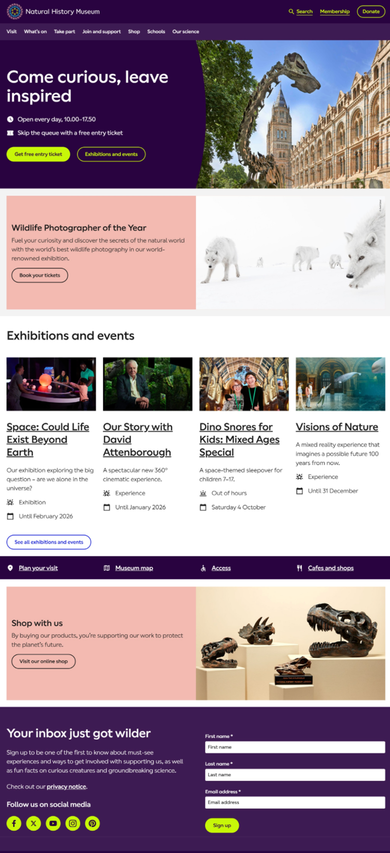
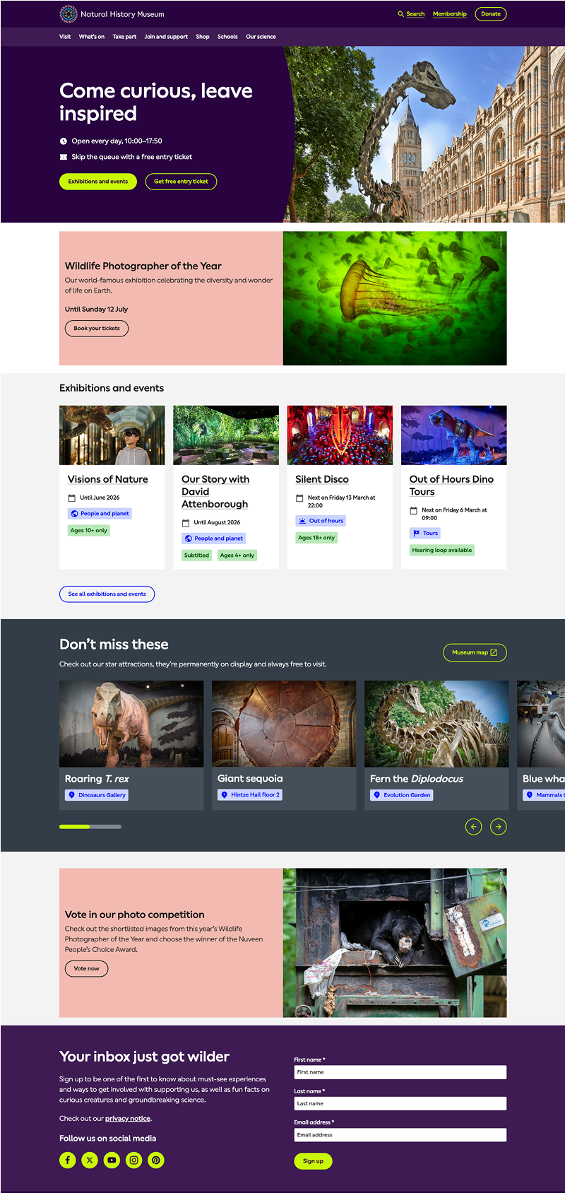
Key design changes

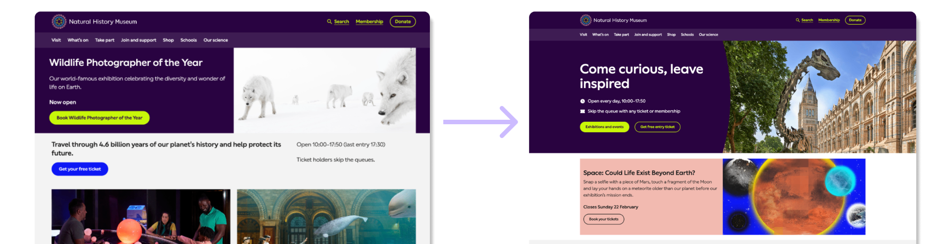
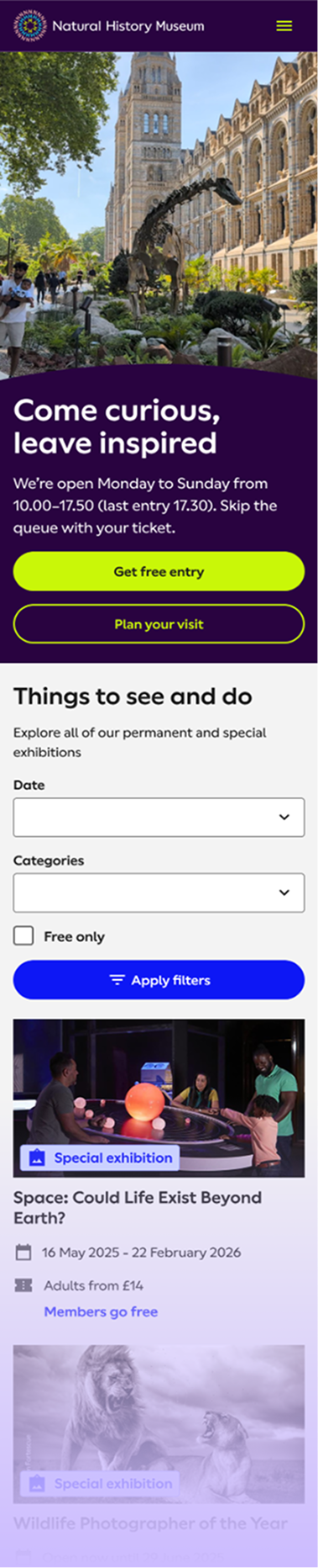
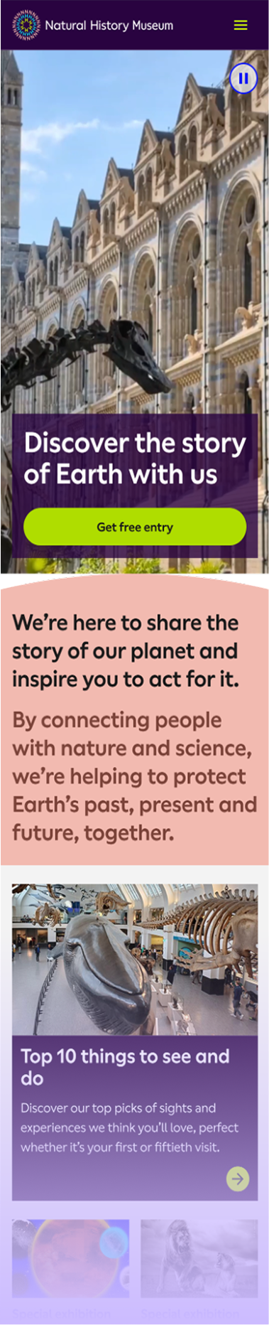
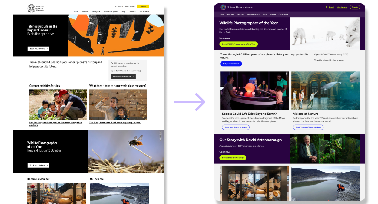
- Switched the purpose of the hero banner from a single exhibition promotion, to a welcoming museum message and links to the 2 different ticket options: free entry and exhibition/events.
- User research had told us that this exhibition promotion had confused users, unsure if they'd come to the website for London's world-famous Natural History Museum.
- It also misled many users to buy exhibition tickets when all they wanted was to visit our permanent galleries, which led to a lot of customer service issues requesting refunds.
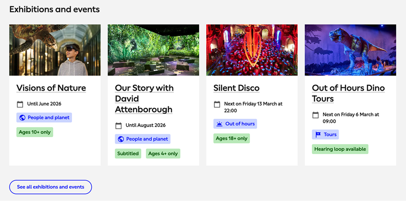
- Created an events and exhibitions summary section, promoting the breadth of our paid offerings more clearly and consistently.
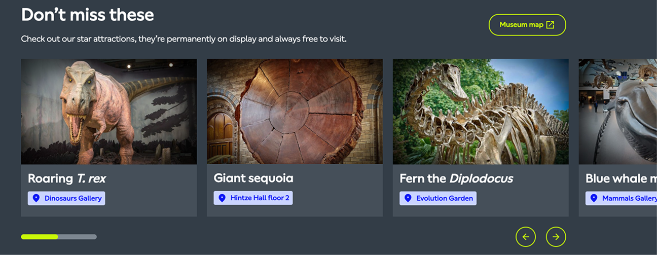
- Added a highlight reel of the top permanent exhibits that we're known for and visitors should not miss, with a link to the map.
- This solved a big problem theme in user research visitors not knowing what they could expect to see when they visit, as a way to push them over the line to book a ticket.
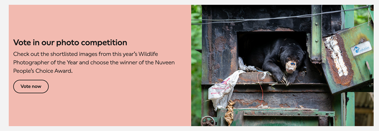
- Limited our non-visit-related content to just 1 slot that changes on a regular content cycle.

- Made the email sign-up copy more concise and inviting, whilst making sure to adhere to GDPR requirements.
- It was out-of-scope to redesign this component, reducing the number of form fields and such but we're working on it next!
Impact
- Increased event and tour bookings by 46%
- Increased revenue/visitor by 2.6% - a huge win given the next point!
- Removed a misleading design pattern that heavily nudged users to book paid tickets and deprioritised the core offer of free entry
- Free entry ticket bookings increased by 6%, leading to a correlated increase in email newsletter signups - a key marketing lever for our revenue drivers
Piqued your interest?
Get in touch
Whether you're looking for a new product design/UX team lead or you'd just like some advice on how to improve your conversion, drop me a line!